Creating a map for use in an advertising or design piece is pretty common for a graphic designer. In our experience it is better to spend your time and energy on aspects such as labels, road markers, traffic flow arrows and various other informational information that can make your map a useful tool. Keep in mind that the purpose of the map is to direct customers, attendees, etc. to your event or location.
You can also use a map to direct people away from an area if there is construction near your business that might make it difficult for them to visit your business.
A map is a handy way to inform customers how to locate your business and or direct them to locations associated with your business such as a warehouse, pickup location, loading dock or drop off location.
Showing your business in relation to the locations of other well know landmarks or businesses.
A good map is accurate.
It should be to scale and include key features such as waterways, lakes, road signs and certain key landmarks.
Be sure your labeling is correctly spelled and be aware of roads that change names or numbers as they progress across the map.
Do not overload the map with information either! Too much info can be confusing so be selective.
Colors can be useful and you can also design and associated these colors or symbols with a key for reference.
Be sure to always keep your map oriented so that north is up and if for some reason you can’t it would then be a great idea to include a compass for reference.
The first step is to attain a clean copy of your map so that you can use the raster image of it or you can take the second step for print quality maps and vectorize the map using AI and their live trace tool.
Step 1: Go to Styled Map Wizzard (link)
Step 2: Search for your location and bring up the map to the proper zoom similar to how you would like for the final image to look. Don’t worry you can zoom in or out and even go to a new location after we adjust the settings and it will preserve the effect as long as you do not hit the reset button between searches.
Step 3: Once you have your location you will then update your settings to the settings I have listed below by adding a style one at a time and setting the details on the left “selectors” panel to mach my styles. Once you have completed this your left “Map Styles” panel should look exactly as mine does below.
Step 4: Once you have adjusted your settings you should end up with a resulting map of your location that looks as my screen shot below came out. Good so far?
Step 5: At this point if you are using this for the web you only need the resolution to be 72dpi and most likely you will have plenty of pixels to work with. If you would like to use this in print you will need to take it a step farther and “vectorize” the image using Adobe Illustrator. Either way you need get a screen capture of the map as you like it. Open the browser window to the largest possible and grab the screen. Your screen capture is then good to crop and use in Photoshop. If you plan to vectorize follow the next steps.
Step 6: Open the image in AI, then select the image. When the image is selected you will see a thin blue line around the perimeter and the little white square “handles” on the image. Now you will hit the “image trace” option at the top menu bar as shown below. I had good luck with “Low Fidelity” as with any good vector drawing you may need to use multiple and pull parts from each to hybrid the best final resulting vector drawing.
Hope you find this tutorial helpful next time you find the need to add a vector map to a piece of design or adverting.
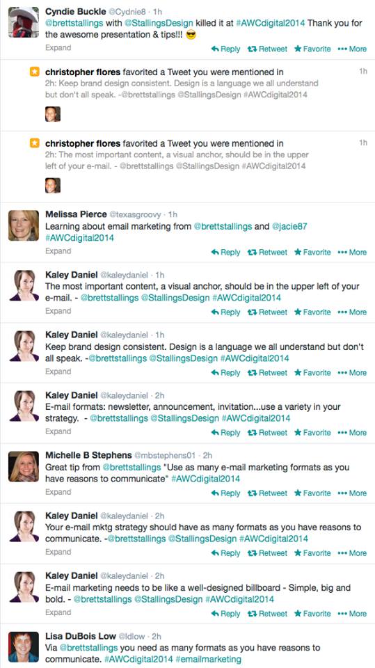
 Had to share a few of our favorite tweets about Brett’s talk at the AWC Digital Media Workshop. It just makes me feel all warm and fuzzy. Big thanks to everyone who came out and it was an honor to be amongst the very talented ladies and a few gentlemen at the Association of Women in Communication event.
Call for Entries: Open to all Texas Tech Students.
Teaching at Texas Tech University as an Adjunct Professor in the School of Art is one of the many things I love about being based in Lubbock Texas. From August to May I get the opportunity to walk the halls of the design school I attended over a decade ago. I rather enjoy how not much has changed about the building, the halls or the great folks who office within them. There may be a few more power strips these days and everyone is required to carry a laptop instead of an X-ACTO. Continue reading “Go fetch some coffee!” »
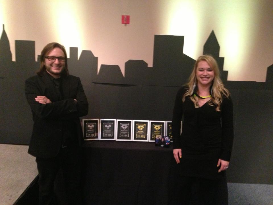
 Stallings Design Wins Six Addys all together. Great night with awesome people!
 We are very pleased and honored that Brett Stallings of Stallings Deisgn Co. has been invited to speak at Social Media 201: Taking Communication to the Next Level. Rapid-Fire Interactive Workshop Featuring 11 Social Media Gurus. Hosted by The Association for Women In Communications Lubbock Professional Chapter.
We are stoked to take home 2 Gold, 1 Silver and 2 Judges choice awards for creative excellence at the 2011 Addy awards in Lubbock Texas.
Continue reading “Stallings Design Wins Big at Lubbock Addy’s in 2011” »